It’s been a whirlwind of activity at Beyond Forward these past few weeks, which explains why I haven’t had time to update the blog in a while. We’re also working on a top-secret project that I hope to be able to write about soon. Suffice to say, the Beyond Forward team is super stoked about it, and we firmly believe it’s going to be a real game-changer (that’s the only clue I’m allowed to divulge). In the meantime, here’s a better late than never quarterly round-up. Let’s get to it.
BANNER AD DESIGN: It’s always good to answer any creative brief with a variety of options. The key of course is to know when to stop. I typically produce 3 initial concepts for the client, so they aren’t overwhelmed with choices. Another consideration: Too many mockups can sometimes indicate that the designer doesn’t have a firm grasp on the creative brief, or a confident approach to tackling the project.
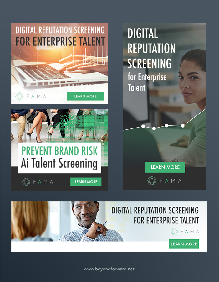
It’s always an interesting challenge dealing with product photos, and fortunately L3 (below) allowed quite a bit of creative freedom to introduce some subtle, but effective manipulation of their product images. Also, this project is a pretty good example of how important color is to a layout. The deep, saturated blues were chosen as the main component in these ads, and the colors accomplish what any good ad should: They demand our attention.

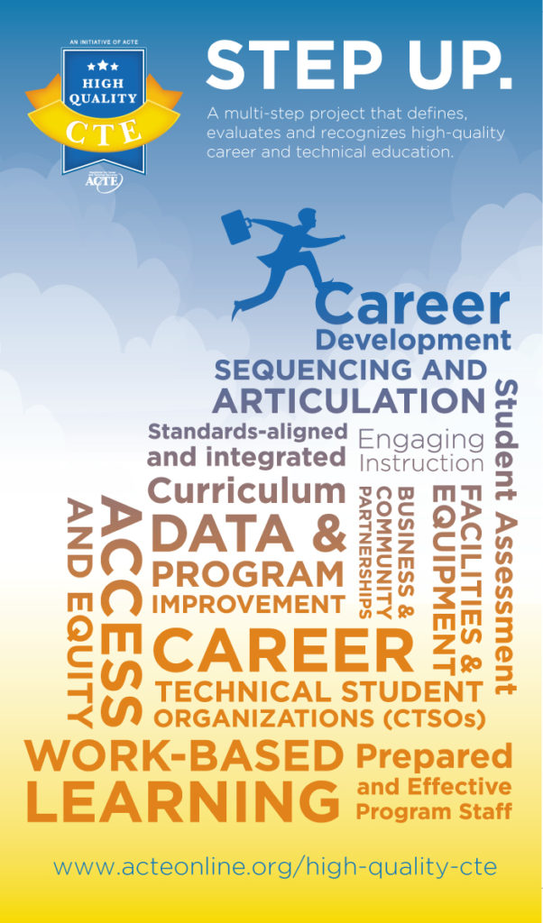
TRADE-SHOW BANNER: Here’s an example of a complex creative brief that was brimming with call-outs and bullet lists, but with no clear message or direction. So, the solution seemed obvious: A word cloud that takes the customer on a journey, using simple design elements to lead the eye from the headline, all the way down the banner:
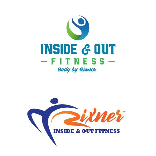
BRANDING: The real trick was to create a logo design that could exist autonomously with or without an icon, while appealing to male and female demographics. Tricky, but if it were easy, everybody would do this, right?
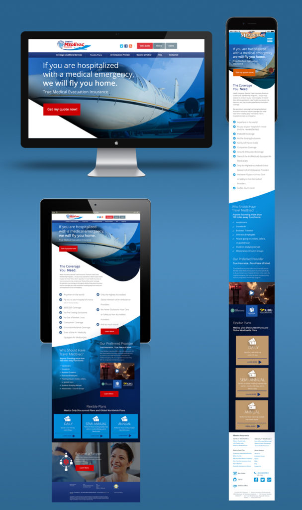
RESPONSIVE WEBSITE DESIGN: One of the challenges in this project was to bring a modern aesthetic to their site, while adhering to their existing branding. I decided the best approach was to keep a continuous curve to the layout, similar to their logo ‘swoosh’. The curved elements in the site are sometimes subtle, and sometimes presented as the central element, but each serves a purpose: Leading visitors toward important copy:
Want to see more? Head over to our brand new twitter page, which features glimpses into current works, design tips, news and other interesting twittery things.
Scott