Weird blog title, I know. It’ll all make sense soon enough. In the meantime, go ahead, bask in the satisfaction of having designed something really, really cool. For Creatives, it’s the little victories that get us through the day, after all. When gushing at that cherished creation, however, it’s easy to ignore fundamental objectives. That shiny new ad, banner, magazine cover or webpage might look great, but underneath all its glory, always ask whether or not you’ve addressed all of the objectives within the creative brief. And even if you’ve technically satisfied all of those requirements, are there any other possibilities to explore? Is there a better way?
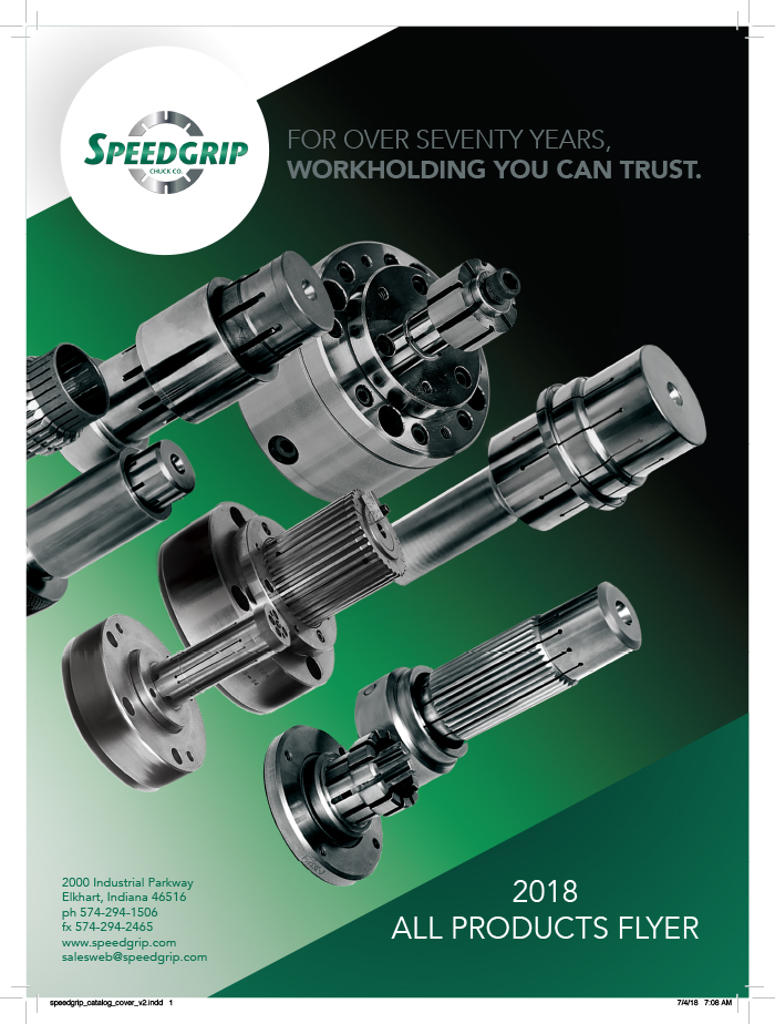
I’ve been working in this field for almost 30 years, and I’m not immune to the ’emotional investment syndrome’. Case in point: This particular project involved a product catalog that required the inclusion of multiple products, while introducing a new call to action. The client provided their original (below left), which they wanted overhauled. I’m all about keeping things simple, to serve the message, but I saw that original layout as a missed opportunity. I wanted to create a new composition, with two main design objectives:
- Motion: The products are engineered to keep objects stationary during a high speed manufacturing process.
- Precision and balance: Exact measurements are crucial, and SpeedGrips products are designed with this in mind.

My first step was to break apart the client’s product photo into individual, editable pieces. Although the perspective wasn’t exactly uniform, I was able to ‘fake it’ and reposition the products in a way that unified them in a more dynamic angle. This also required a bit of photoshop cleanup, as some of the objects overlapped each other.
With the silver and burnished metallic part colors, I knew there needed to be a strong, dark contrasting background that adhered to the branded colors. End result: the products are pointing toward the headline, and toward the right edge of the cover, suggesting an arrow to open the catalog. A few minor iterations later, and this became the final, approved version (below):
About that ’emotional investment’ bit. So, I had presented the client with two options. An alternate version of the cover (below) was rejected, but I’m including it here to illustrate my point.

This rejected version is far more complex, reduces the product images and relies more on the various design elements around it. Here’s a time-lapse video highlighting the creation of the infographic:
I really liked this one, but the client preferred my other version. I needed to understand why. So, I took a step back and began to look at the design with a more objective eye. The best way to do that, I’ve found, is to literally step back. The answer had been there all along. As technically intriguing as this design was to me, the infographic practically obscures the actual product images, and the vector drawing in the center puts too much focus on one product. I love the clean symmetry of this design, and it’s definitely a keeper for the portfolio–that place where many other inspired, emotionally invested pieces reside.
SR