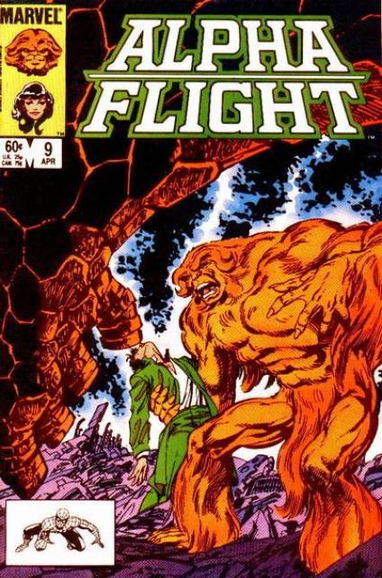
It’s no surprise that Graphic Designers are influenced by their interests and preferred aesthetics. For me, I’m deeply ingrained in the comic book design sensibility, and much of my graphic design work is still informed by the same dynamic ingredients of sequential art, and in particular, cover art and logo treatments, all the way down to color. As with great design, nothing happens by accident in a great comic book design. Get ready for deep level comic book geekery in this post.
Alpha Flight #7, drawn by John Byrne, is a perfect example of purposeful use of color to help unify a concept, while leading the eye toward a key element within the layout itself. The great colorist Andy Yanchus links the Alpha Flight logo colors with the character’s clothing color. We want to know who this person is, because on a subconscious level, we already know that they are important to the story, thanks to this subtle association between the logo and the character.
I was a kid when I first read this comic, so I didn’t really register or care anything about the design elements. But now, I have a strong appreciation, almost a reverence for these quiet, yet powerful design decisions. This is the kind of thinking that separates a mediocre design from something meaningful; a design ultimately has to serve as a call to action. The unwritten CTA of every comic book should always be a simple, imperative ‘Buy this comic’. It’s not the concept, line-art, logo or messaging that compels readers to open this particular comic. As much as I admire John Byrne’s mastery of composition and line-art, it’s that connected green that calls attention to a mystery.


