There have been several pretty interesting projects coming down the pipeline these past couple months, and unsurprisingly I've had little time to devote to internal marketing, particularly this blog. But here we are now, so let's get right to the stuff. Here's a brief overview of a recently completed project:
INFOGRAPHICS:
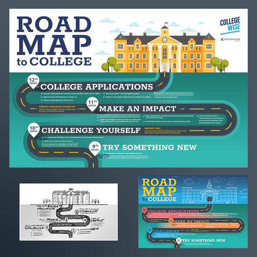
Complex messages converted to visual graphics can be a challenge, especially when vital information or data must be included, without overwhelming the reader. In this case, I had to find a way to show a journey, while compartmentalizing important bulleted lists so that it all made sense. Color choice is key here, making sure that callouts are legible, and creating a typographical hierarchy. Below are my initial concept sketches:

And the final illustration, all rendered as scalable vector graphics. The final output is intended as a large banner:

If you're a business owner, ask yourself how your mission statements and product or event marketing might be more effective by introducing a visual sequence or graphics-driven call to action. Infographics, when done just right, provide an accessible, easy to understand message for consumers. Something I try to keep in mind when designing: Most people briefly scan content online or in print before honing in areas of interest. It's a 2-second rule, in which time the graphic and headline has to grab their attention long enough for them to absorb the message and want to stick around and learn more.
That might not be a concern someday, however. I can imagine a day in the not-too-distant future when design and language is reduced to base iconography, the two forms becoming indistinguishable, and shockingly simple by today's standards. But we're still a long ways from that. In the meantime, we have infographics.
SR