I thought we were living in strange times before the Covid Pandemic hit, but now those times seem quaint by comparison. As we're all adjusting to this, I'm doing what you're probably doing: finding ways to maintain some semblance of normalcy. A lot of well-laid plans have been shattered for countless business, including my own. For example, if you read my previous post from a few months ago, you'll know that by now I should have had a refresh on this website, but I've had to put that project on the back burner for the time being. My clients needs are always top priority, and right now many are struggling to find inventive ways to maintain brand awareness while prompting their customers to engage in their services/products in the face of a suddenly struggling economy. I'm here to help. I don't have all the answers, but I do have some ideas.
As a Graphic Designer with many years of marketing experience, I thought I had seen it all, from confronting design relevancy in the aftermath of 9/11, to reshaping the aesthetic of materials produced during the great recession of 2008. I don't think any of us can predict what the design and marketing landscape will look like once the Covid Pandemic has ended, but I can almost guarantee that it's going to be different.
For now, I'm focused on what's right in front of me, working with clients who are turning to me for solutions to problems that none of us really know how to grapple with quite yet. That being said, know that I'm hard at work researching those creative solutions and it's my goal to help your business not only survive, but function with a distinct advantage, as we are all working together for a common purpose.
SR
TRADE SHOW BOOTH GRAPHICS & MORE
Recently I helped produce graphics for ZeeVee's multi-tiered marketing campaign. A lot of planning went into this one, from updating various branded elements to introducing new infographics that bridged actual product designs with representational illustrations. These images helped communicate exactly how the products are connected, while maintaining a 'satellite view' that doesn't overwhelm the potential customer with too much data. That's always a challenge when dealing with designing in the tech space, whether it's an app or an apparatus. Fortunately, I think we found a perfect balance.

WEBSITE DESIGN
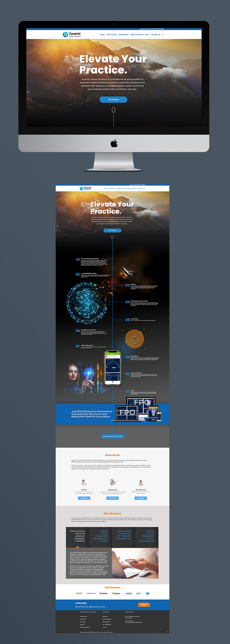
This was an interesting project; providing a partial facelift to an existing site design. My role in this one was to replace the old graphics with more meaningful and compelling images that helped tie together the messaging, leading the eye into important call-to-actions. Since the site itself uses a parallax effect, the free-floating graphics offer a fluidity of navigation that helps keep visitors engaged through a layout that serves as an infographic.


